Monthly Archives

September 2018

Constructing the Death Star for 7 Wonders.

7 Wonders: Making of the Death Star

I am likely one of the hardest-core Star Wars fans you’ll ever meet. I’ve been reciting the movies with my big sister for as long as I can remember. I can literally wear a different Star Wars t-shirt to work for at least three weeks straight without repeating. My D&D 5e Monk is named Bomarr, after the the B’omarr Order monks whose palace Jabba squatted in after they gave up their bodies in search of enlightenment. I am STILL mourning — MOURNING — how Karen Traviss’ rich Mandalorian culture was nonchalantly swept from canon. Right now, my favorite Star Wars characters might very well be the psychotic murder droids Triple-Zero and BT-1. And in my opinion, the best reveal in Solo: A Star Wars Story wasn’t Darth Maul, it was the use of Teräs Käsi!

So, when it came to making geeky pop-culture-influenced custom boards for 7 Wonders, the very first thing I had to make was the Death Star.

Step zero: Prepare yourself

Before we go any further, there’s a few things that will genuinely make this article more useful.

  1. Learn AT LEAST basic skills in Adobe Photoshop or GIMP.
  2. Commit to learning keyboard shortcuts.
  3. Read my 7 Wonders “how to” overview.

(There’s very little in this article that actually ties to number two, but knowing keyboard shortcuts will make you exponentially more efficient. And after all, who… does… number… two… work… for?!)

Step one: Find some art

I always start with a Google Image search. In this case, I searched with the phrase “Star Wars art”. Why the additional criteria of “art”? Because I prefer not to work with screen caps and photo stills if at all possible because I find that starting with something painted — even digitally painted — will match the general style of the real 7 Wonders boards better. Regardless of image source, I’ll always do some sort of image manipulation, but we’ll get to that later.

More importantly, remember to search for the biggest image you can possibly find because you’re ultimately going to be printing in 300dpi. Web-optimized images are generally going to be in a lower resolution with a smaller footprint. Take the extra time and specify that you’re searching for large images under “Tool” like this:

Use your Google Image search filters wisely!

I eventually stumbled across a digital rendering of the Death Star II by Nathan Lange on ArtStation. By chance, it was even offered as a downloadable 1920×1080 px @ 72 ppi file. By comparison, my 7 Wonders template is 2925×1275 px @ 300 ppi.

Step two: Tweak the image

The very first thing I had to do to the image was stretch it out to fit the template. When using Adobe Photoshop, you should hold down “Shift” while (Command + T) transforming the image in order to maintain the image’s original ratio. I HATE it when I see half-assed image sizing that distorts an image.

Keep your aspect ratio when sizing images!

When resizing the image, I do think about composition. A lot of times, it’s just easiest to keep large objects centered on the board. Other times, it doesn’t hurt to keep the Rule of Thirds or Golden Ratio in mind. In the case of the Death Star and the Nathan Lange’s source material, I decided to just keep it simple and centered. In the context of 7 Wonders boards, you also have to be aware of how the starting resource, title, and monument stages will interplay with the image.

If you severely resize an image, you’re inevitably going to lose some fidelity. Depending on how much you’ve stretched out an image, there are ways to address this and still make it look good on a 7 Wonders board. My go-to technique is to apply the Dry Brush filter. Below, on the left of the guide is the resized image prior to any filters being applied. To the right of the guide is the same image having had the Dry Brush applied to it with Brush Size set to 1, Brush Detail set to 10, and Texture set to 3.

I heart the Dry Brush artistic filter!

In the case of the Death Star, the image resizing wasn’t actually that harmful. However, it did pick up some light blurriness and it still retained a very “smooth” look. I prefer something that looks more painted to better match the official game boards. This is entirely a matter of personal preference. You definitely lose some of the original detail, but the dry brush filter looks GREAT on the finished product. And it’s a technique I use on every board to make them all more consistent with one another.

One EXTREMELY important point here… the Artistic Filters may be hidden by default in the current version of Photoshop. You’ll likely have to manually expose them per Julieanne Kost’s directions from this old blog post.

Step three: Make it playable

There are several things to consider when setting up a custom board for 7 Wonders:

  1. What starting resource makes sense in the context of the theme of the board?
  2. How many monument stages should this board have and why?
  3. How much do each of the monument stages cost and why?
  4. What do you get in return for building the monument stage and why?
  5. Is what you’re proposing under- or over-powered?
  6. Will it play differently than every board already in existence?
  7. Would it be fun to play?

Oh look, that was kinda sorta seven things for 7 Wonders!

At one point, I had considered using the standard three stages for the monument, but it simply didn’t look right and it didn’t feel right. The Death Star had to be one giant THING, so decided to design one giant stage. Additionally, I determined that I wanted to build thematically around the Sith Rule of Two.

It was this concept that helped guide the construction of the board. There should only be a master who wields the power and an apprentice who craves it. As such, the starting monument immediately does away with two leaders, but allows you to play two leaders without having to pay the cost. In theory, this could be an enormous advantage, starting with two leaders when everyone else may only start with one. However, you have to make a choice before playing any other cards, so one of your leaders may end up with minimal value.

The lone monument stage costs a bunch of ore (a proxy for durasteel) and money (because the two Death Stars must have cost a A LOT of imperial credits). But most importantly, you also have to sacrifice a leader, symbolizing an apprentice betraying his master.

As a reward, you get a war, straight up victory points, and the ability to play your final two cards every age after you’ve built your monument.

Step four: Pick colors

You’re going to need to pick two colors: one for the rounded rectangle main area of the monument stages and one for the ornate contoured frame around the main monument stage area. I usually use the color picker tool to select two different contrasting colors that already exist within the original artwork.

Using the Photoshop Color Picker tool.

Contrast can take form though selecting one light and one dark color from the source material. Another is selecting opposing color wheel combinations that exist in the source material. I rarely select a color that is completely non-existant in the image. The only time I choose to do this is when the source image is overly monochromatic. And then I search for a complimentary color from the color wheel to make the end result more dynamic.

A few tips to make your life easier:

  1. It doesn’t hurt to write down the Hex Color values in case you ever need to reference the exact colors you’ve selected. In the example above, the value is #065d59.
  2. Instead of selecting the shapes and forcibly filling them with the colors of your choice, use Blending Options for the layer to apply the Color Overlay Effect. It’s cleaner, more flexible, and more efficient in the long run. Right-clicking on a layer will make the Blending Options, err.. option available.
  3. For the main area of the monument stage, in addition to using Color Overlay, you should also adjust the opacity of the layer to allow some of the board’s imagery to be visible through the rounded rectangle. Again, this is consistent with design of the official boards and is a simple and efficient technique to get the look you want. Try anything between 50-75% opacity; this isn’t one size fits all. See below for an example of what all this looks like in the Layers panel.
Blending Options Effects in the Layers panel.

And theeeeeeen?

And then you’re you on to flattening your image, creating a printable document, printing your design, cutting your parts, assembling your board, and play-testing your concept. You may want to tackle that in a different order but that’s what I like to do. (Yes, I realize that I’m likely creating a bunch of extra work for myself when revisions are necessary, but it makes for a much more satisfying play-test experience.) Again, I’ve written up those general steps here.

Future 7 Wonders posts will likely be less about my Photoshop process and more about the source material and reasoning behind the board creation. Let me know if you have any questions in the comments below!

Magic the Gathering vampires.

Magic the Gathering: Fourth time’s the charm for my vampire deck

You may remember a while ago, I was determinedly tweaking my black/white mana vampire deck to combat my son’s all-blue, Jace-led, mostly-merfolk Magic the Gathering deck. I’ve since modified my deck three more times with varying degrees of success. However, the most recent version seems to have made the most significant impact.

Vampires, the next generation.

Creature (29)

  • 2 Captivating Vampire
  • 2 Drana’s Emissary
  • 2 Gifted Aetherborn
  • 2 Inspiring Cleric
  • 2 Martyr of Dusk
  • 2 Paladin of the Bloodstained
  • 2 Tithe Drinker
  • 2 Vampire Cutthroat
  • 2 Vampire Neonate
  • 1 Blood Artist
  • 1 Blood Seeker
  • 1 Bloodrite Invoker
  • 1 Bishop of the Bloodstained
  • 1 Drana, Kalastria Blood Chief
  • 1 Elenda, the Dusk Rose
  • 1 Gatekeeper of Malakir
  • 1 Legion Lieutenant
  • 1 Mavren Fein, Dusk Apostle
  • 1 Skymarch Bloodletter
  • 1 Vampire Nocturnus

Enchantment (1)

  • 1 Legion’s Landing

Sorcery (2)

  • 2 Call to the Feast

Instant (2)

  • 1 Moment of Craving
  • 1 Moment of Triumph

Land (25)

  • 9 Swamp
  • 4 Forsaken Sanctuary
  • 4 Kabira Crossroads
  • 4 Piranha Marsh
  • 4 Scoured Barrens

Planeswalker (1)

  • 1 Sorin, Lord of Innistrad

Even vampires don’t always get it right on the first try.

Really, one of the simplest changes came out of a very simple observation made by my ten-year-old. Despite fielding a semi-spammy low-mana deck, I found that the luck of the draw left me land-starved more often than not. My son’s very astute suggestion of increasing my land-to-other-card ratio was probably one of the most beneficial changes I made.

The other change that seemed to have significant impact was doubling down on lifelink, “gain 1 life,” “lose 1 life,” and “create a 1/1 [token]” cards while eliminating most others. As a result, I’m constantly gaining a life here and there while my opponent loses a life just as frequently. I suspect this makes my deck super-annoying to play against which makes it even more appealing to me.

Up next? Figuring out a sideboard.

Then? Tweaking my five-mana, no-creature deck!

Vampire notes!

I always like it when things match and coordinate, so I’ve since tricked out my deck with some accessories that I thought I’d share:


Custom Cards Against Humanity cards.

How to make custom Cards Against Humanity cards

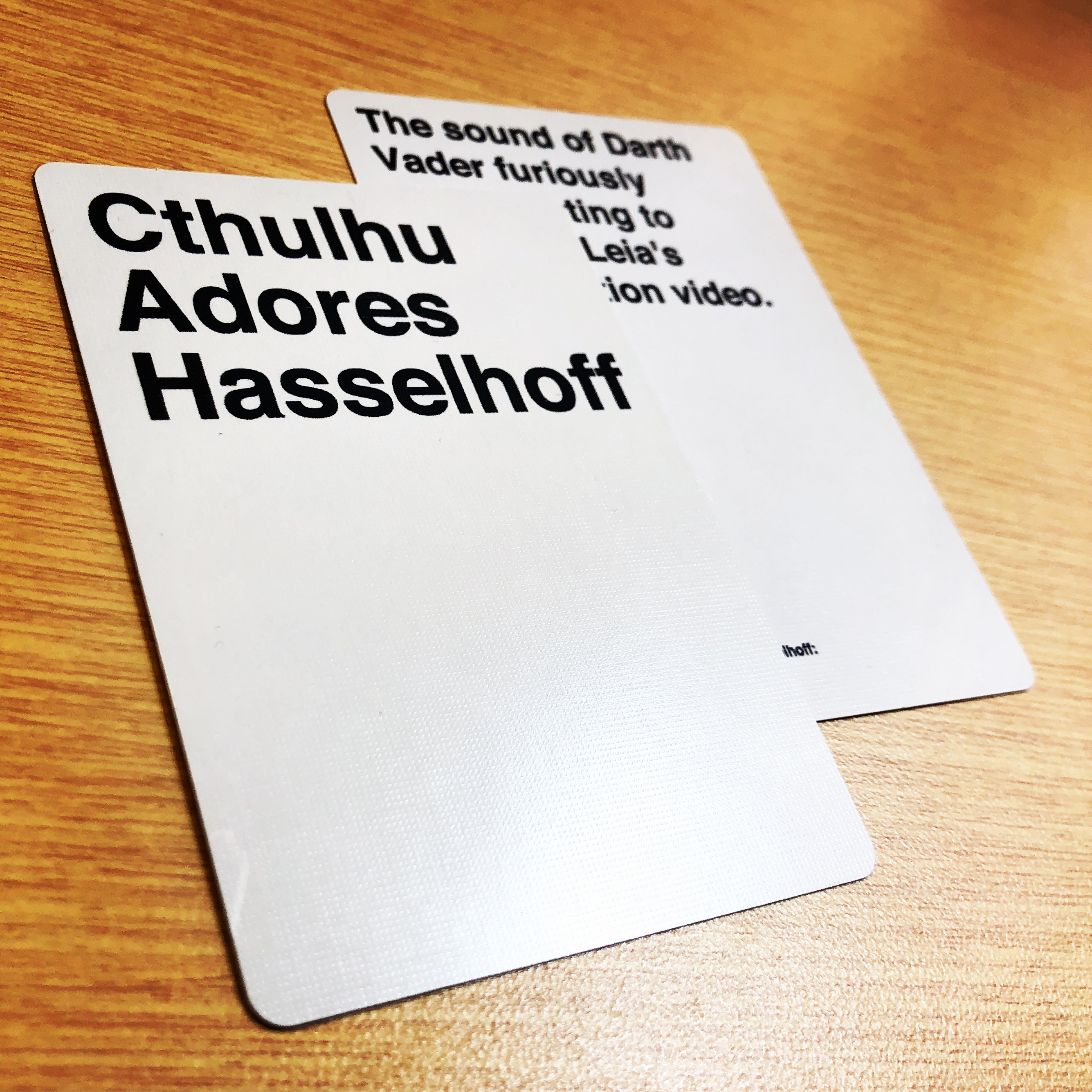
Cards Against Humanity recently had an open call for submissions which reminded me that I’d never posted about my very first foray into making custom game expansions three years ago. I decided to try my hand at making custom Cards Against Humanity cards for my Virginia Beach gaming friends-that-are-basically-family. After all, why wouldn’t you want cards that mention your friends by name?

Working backwards against humanity.

As opposed to what the cards would actually say, I started with “how the heck am I going to print cards that have the right size, right texture, and right per-unit pricing that won’t cost me a crap-ton to produce a small run of cards?” After using my mad Google skills, I discovered that Printer’s Studio can print custom content onto premium 310gsm linen-textured 63x88mm cards. Furthermore, you can customize the fronts AND backs of each individual card so that you can make your custom white and black Cards Against Humanity cards all in one go!

Production checklist against humanity.

  • Crafting Supplies
    • None, because Printer’s Studio is doing all of the physical goods production for you.
  • Files
    • Printer’s Studios Photoshop template (standard poker-sized).
    • Max Miedinger’s/Linotype Design Studio’s Neue Helvetica 75 Bold font.
    • Or just use another similar sans serif font like or Helvetica or Arial.
    • Alternatively, if you ever intend to publicly distribute your cards, you may want to REALLY differentiate your product with a dramatically different font.
    • If you’re really ambitious, you could try this old code I stumbled across in GitHub.
  • Software
    • Adobe Photoshop (the $9.99/month 20GB photography plan is more firepower than you’ll need).
    • Feeling cheap? Go with GIMP instead.
  • Intangibles
    • A sick sense of humor.
    • Human sounding-boards.
    • Time.

Disclaimers against humanity.

Before we go any further, I want to list a few disclaimers:

  • Please don’t steal. That includes intellectual property.
  • Be smart and don’t get sued. Here’s an interesting article with law words and here’s one about “bullying copycats.”
  • Do it because you love it, not because you’re trying to be a table-top-game-bijillionaire.
  • I will NEVER sell my grossly infringing cards as they’re intended for personal use ONLY. (However, if I have a really great idea for way less infringe-y cards, I WOULD consider that.)

What’s next against humanity?

Here’s a high-level breakdown of my process:

  1. Create an accurate Photoshop template. Do yourself a favor and measure better than I did and set up your guides appropriately. I started my text right at the “safe” dotted red line when I really needed to allow for more white space around the borders. Use a ruler, write down the measurements, and change your Photoshop ruler to inches instead of pixels. Make sure you’re working with a 300dpi file.
  2. Layers are your friends! Save every distinct card’s text as its own layer in case you need to go back and change stuff. It makes like dramatically easier.
  3. Keep your template organized. Use folders and layers. Lots of them.
  4. Birth your own brand. In the category of “please don’t steal”, make your own brand even if you’re just doing it for personal use.
  5. Design the card back. With your brand birthed in a disturbingly wet and messy push, design a back for your cards. Remember to do it with white-on-black and black-on-white.
  6. Prepare for print. Save every unique card front and back as a separate flattened file. PNGs work just fine.
  7. Set up your project and purchase! Once you have your project all set up and you’ve THOROUGHLY QAed your work, submit your order.

PS against humanity.

In case you’re wondering what my example card says, I’ll give you a hint. Two of the missing words are “Princess” and “interrogation”. You can fill in that first blank yourself.