I am likely one of the hardest-core Star Wars fans you’ll ever meet. I’ve been reciting the movies with my big sister for as long as I can remember. I can literally wear a different Star Wars t-shirt to work for at least three weeks straight without repeating. My D&D 5e Monk is named Bomarr, after the the B’omarr Order monks whose palace Jabba squatted in after they gave up their bodies in search of enlightenment. I am STILL mourning — MOURNING — how Karen Traviss’ rich Mandalorian culture was nonchalantly swept from canon. Right now, my favorite Star Wars characters might very well be the psychotic murder droids Triple-Zero and BT-1. And in my opinion, the best reveal in Solo: A Star Wars Story wasn’t Darth Maul, it was the use of Teräs Käsi!
So, when it came to making geeky pop-culture-influenced custom boards for 7 Wonders, the very first thing I had to make was the Death Star.
Step zero: Prepare yourself
Before we go any further, there’s a few things that will genuinely make this article more useful.
- Learn AT LEAST basic skills in Adobe Photoshop or GIMP.
- Commit to learning keyboard shortcuts.
- Read my 7 Wonders “how to” overview.
(There’s very little in this article that actually ties to number two, but knowing keyboard shortcuts will make you exponentially more efficient. And after all, who… does… number… two… work… for?!)
Step one: Find some art
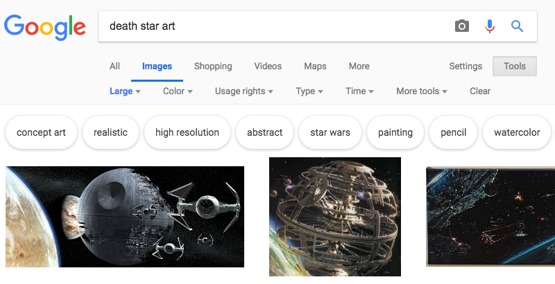
I always start with a Google Image search. In this case, I searched with the phrase “Star Wars art”. Why the additional criteria of “art”? Because I prefer not to work with screen caps and photo stills if at all possible because I find that starting with something painted — even digitally painted — will match the general style of the real 7 Wonders boards better. Regardless of image source, I’ll always do some sort of image manipulation, but we’ll get to that later.
More importantly, remember to search for the biggest image you can possibly find because you’re ultimately going to be printing in 300dpi. Web-optimized images are generally going to be in a lower resolution with a smaller footprint. Take the extra time and specify that you’re searching for large images under “Tool” like this:
I eventually stumbled across a digital rendering of the Death Star II by Nathan Lange on ArtStation. By chance, it was even offered as a downloadable 1920×1080 px @ 72 ppi file. By comparison, my 7 Wonders template is 2925×1275 px @ 300 ppi.
Step two: Tweak the image
The very first thing I had to do to the image was stretch it out to fit the template. When using Adobe Photoshop, you should hold down “Shift” while (Command + T) transforming the image in order to maintain the image’s original ratio. I HATE it when I see half-assed image sizing that distorts an image.
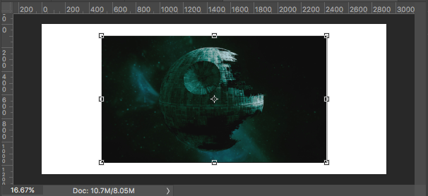
When resizing the image, I do think about composition. A lot of times, it’s just easiest to keep large objects centered on the board. Other times, it doesn’t hurt to keep the Rule of Thirds or Golden Ratio in mind. In the case of the Death Star and the Nathan Lange’s source material, I decided to just keep it simple and centered. In the context of 7 Wonders boards, you also have to be aware of how the starting resource, title, and monument stages will interplay with the image.
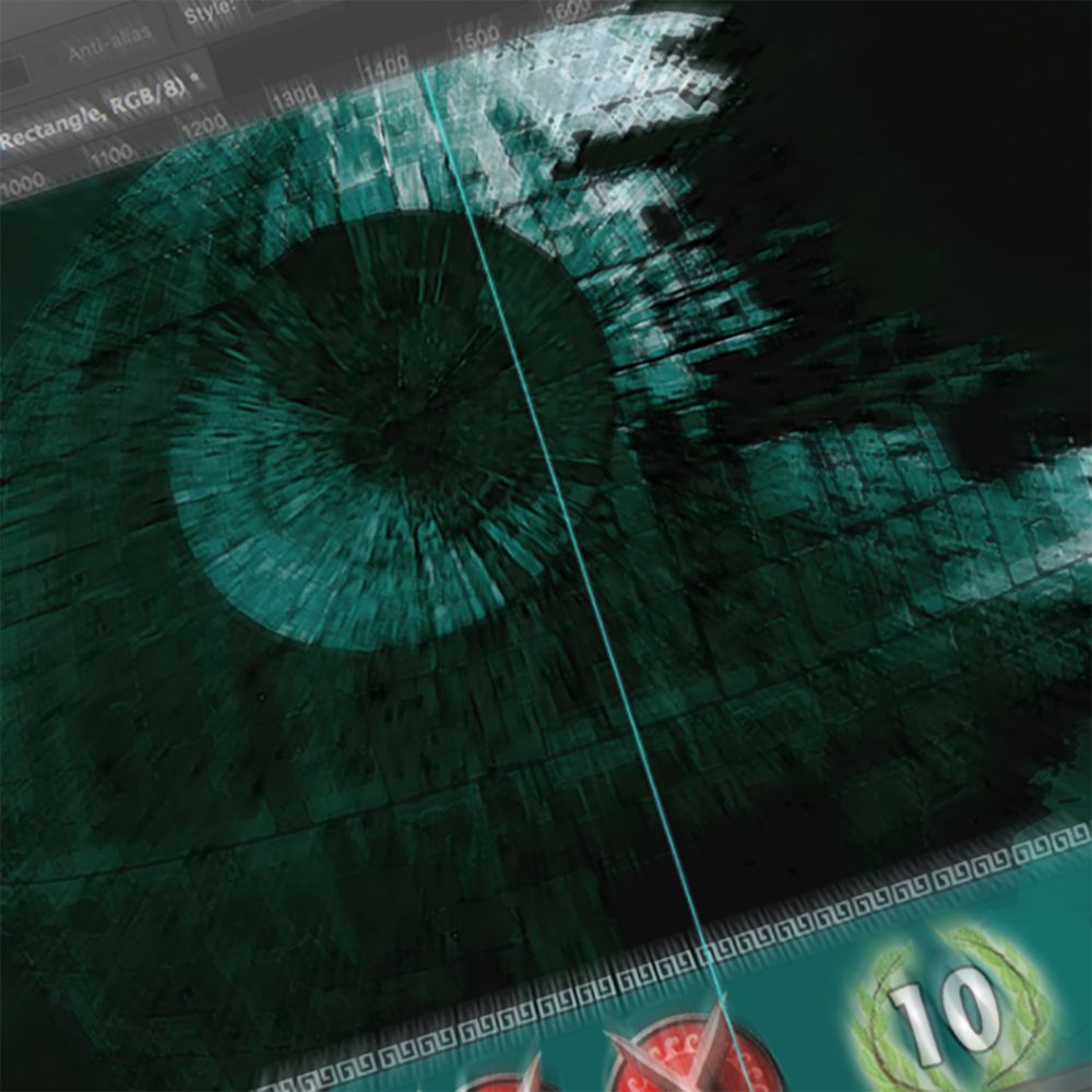
If you severely resize an image, you’re inevitably going to lose some fidelity. Depending on how much you’ve stretched out an image, there are ways to address this and still make it look good on a 7 Wonders board. My go-to technique is to apply the Dry Brush filter. Below, on the left of the guide is the resized image prior to any filters being applied. To the right of the guide is the same image having had the Dry Brush applied to it with Brush Size set to 1, Brush Detail set to 10, and Texture set to 3.
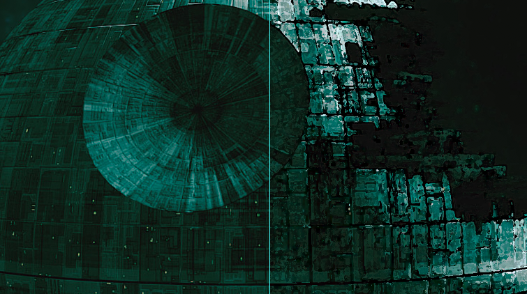
In the case of the Death Star, the image resizing wasn’t actually that harmful. However, it did pick up some light blurriness and it still retained a very “smooth” look. I prefer something that looks more painted to better match the official game boards. This is entirely a matter of personal preference. You definitely lose some of the original detail, but the dry brush filter looks GREAT on the finished product. And it’s a technique I use on every board to make them all more consistent with one another.
One EXTREMELY important point here… the Artistic Filters may be hidden by default in the current version of Photoshop. You’ll likely have to manually expose them per Julieanne Kost’s directions from this old blog post.
Step three: Make it playable
There are several things to consider when setting up a custom board for 7 Wonders:
- What starting resource makes sense in the context of the theme of the board?
- How many monument stages should this board have and why?
- How much do each of the monument stages cost and why?
- What do you get in return for building the monument stage and why?
- Is what you’re proposing under- or over-powered?
- Will it play differently than every board already in existence?
- Would it be fun to play?
Oh look, that was kinda sorta seven things for 7 Wonders!
At one point, I had considered using the standard three stages for the monument, but it simply didn’t look right and it didn’t feel right. The Death Star had to be one giant THING, so decided to design one giant stage. Additionally, I determined that I wanted to build thematically around the Sith Rule of Two.
It was this concept that helped guide the construction of the board. There should only be a master who wields the power and an apprentice who craves it. As such, the starting monument immediately does away with two leaders, but allows you to play two leaders without having to pay the cost. In theory, this could be an enormous advantage, starting with two leaders when everyone else may only start with one. However, you have to make a choice before playing any other cards, so one of your leaders may end up with minimal value.
The lone monument stage costs a bunch of ore (a proxy for durasteel) and money (because the two Death Stars must have cost a A LOT of imperial credits). But most importantly, you also have to sacrifice a leader, symbolizing an apprentice betraying his master.
As a reward, you get a war, straight up victory points, and the ability to play your final two cards every age after you’ve built your monument.
Step four: Pick colors
You’re going to need to pick two colors: one for the rounded rectangle main area of the monument stages and one for the ornate contoured frame around the main monument stage area. I usually use the color picker tool to select two different contrasting colors that already exist within the original artwork.
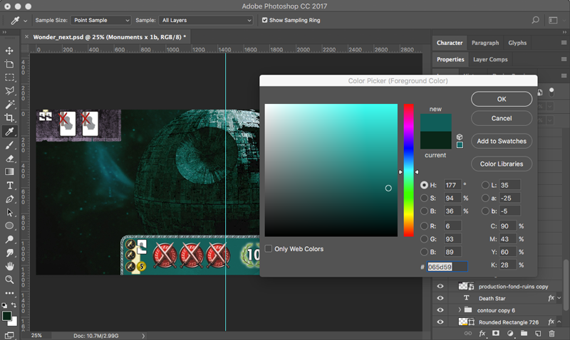
Contrast can take form though selecting one light and one dark color from the source material. Another is selecting opposing color wheel combinations that exist in the source material. I rarely select a color that is completely non-existant in the image. The only time I choose to do this is when the source image is overly monochromatic. And then I search for a complimentary color from the color wheel to make the end result more dynamic.
A few tips to make your life easier:
- It doesn’t hurt to write down the Hex Color values in case you ever need to reference the exact colors you’ve selected. In the example above, the value is #065d59.
- Instead of selecting the shapes and forcibly filling them with the colors of your choice, use Blending Options for the layer to apply the Color Overlay Effect. It’s cleaner, more flexible, and more efficient in the long run. Right-clicking on a layer will make the Blending Options, err.. option available.
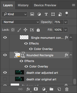
- For the main area of the monument stage, in addition to using Color Overlay, you should also adjust the opacity of the layer to allow some of the board’s imagery to be visible through the rounded rectangle. Again, this is consistent with design of the official boards and is a simple and efficient technique to get the look you want. Try anything between 50-75% opacity; this isn’t one size fits all. See below for an example of what all this looks like in the Layers panel.
And theeeeeeen?
And then you’re you on to flattening your image, creating a printable document, printing your design, cutting your parts, assembling your board, and play-testing your concept. You may want to tackle that in a different order but that’s what I like to do. (Yes, I realize that I’m likely creating a bunch of extra work for myself when revisions are necessary, but it makes for a much more satisfying play-test experience.) Again, I’ve written up those general steps here.
Future 7 Wonders posts will likely be less about my Photoshop process and more about the source material and reasoning behind the board creation. Let me know if you have any questions in the comments below!