It started as 6th grade math. I recently started helping my 6th grader with a little extra math homework. I… Read more TIAMATH: D&D-themed math worksheets!
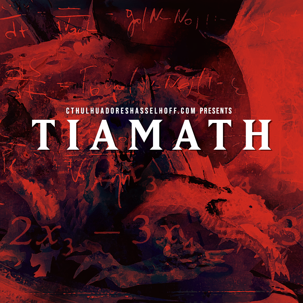
It started as 6th grade math. I recently started helping my 6th grader with a little extra math homework. I… Read more TIAMATH: D&D-themed math worksheets!
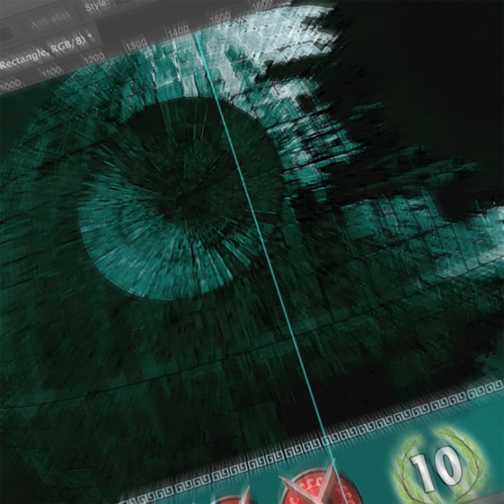
I am likely one of the hardest-core Star Wars fans you’ll ever meet. I’ve been reciting the movies with my… Read more 7 Wonders: Making of the Death Star

You may remember a while ago, I was determinedly tweaking my black/white mana vampire deck to combat my son’s all-blue,… Read more Magic the Gathering: Fourth time’s the charm for my vampire deck
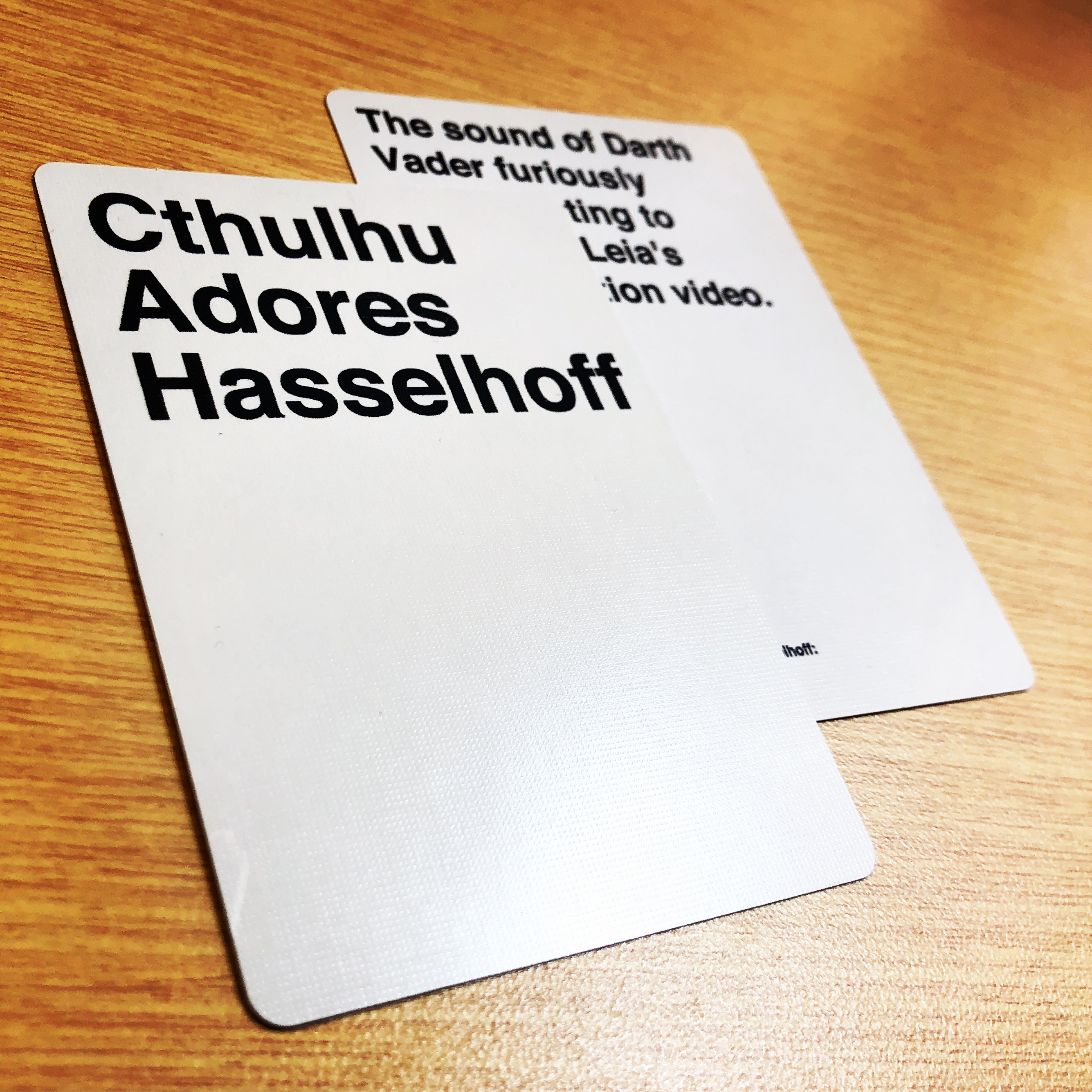
Cards Against Humanity recently had an open call for submissions which reminded me that I’d never posted about my very first… Read more How to make custom Cards Against Humanity cards
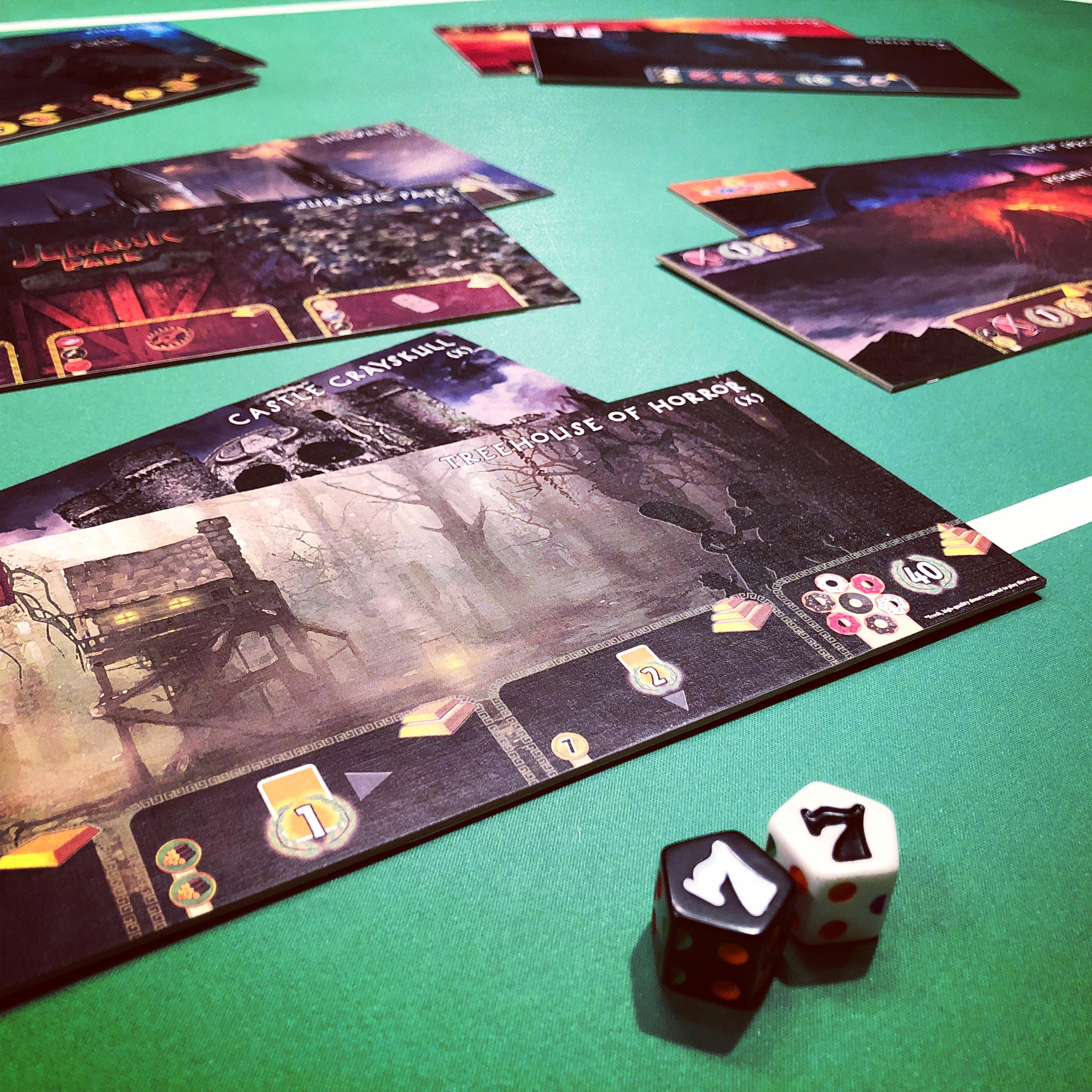
I’m just a little obsessed with 7 Wonders. I own and love all the expansions (except Babel). I’ve gifted 7… Read more How to make custom boards for 7 Wonders

Our beloved Dungeon Master at Alpha Omega Hobby has a copy of an old book titled Central Casting: Heroes of… Read more Quest for a Clockwork Dog D&D Miniature

“If your friends all jumped off a bridge, would you?” Well, no. But if my Dungeons & Dragons Adventurers League… Read more Hero Forge: Peer-pressured into custom D&D miniatures

I’ve never been big a huge fan of podcasts. I occasionally listen to Song Exploder, Bill Simmons, Locked On Celtics,… Read more Inspiration from PAX East 2018: Acquisitions Inc.?

I’m not kidding when I say I NEVER imagined that I’d ever pick up miniature-painting as a hobby. I didn’t… Read more Reaper Bones Miniatures from a CRAZY generous co-worker!

I am a COMPLETE n00b when it comes to painting miniatures. I have literally one lesson under my belt from… Read more Star Wars Legion: Amateur hour painting